Tuesday, February 28, 2012
Assignment #2: Family History
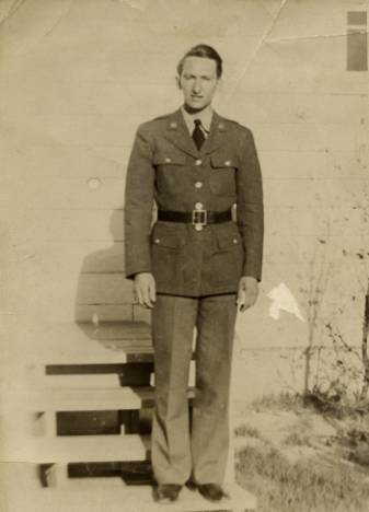
Here's my version of assignment 2. Kind of a montage of several generations who all went to the same school and their most noticeable character traits.
Tuesday, February 21, 2012
Family History
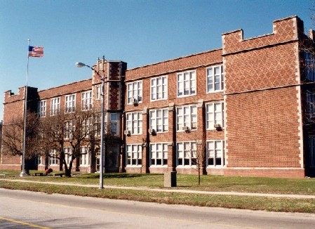
Here's a photo of the West Frankfort High School, which has been around for generations. I might use it as a unifying factor in the collage.
A tooth logo that sort of looks like a badge. My grandpa was a military dentist during WW2, so I'd like to represent that with a couple of images.
Logo from my home town high school.
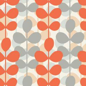
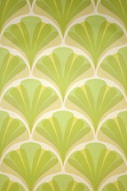
A series of wallpaper samples from different generations.
These two would be kind of a play on my grandma's "neat" generation of being clean and proper.
Some stock fashions from the 50's and 70's. I will probably cut and paste the elements I want to represent my family members.
Just a little thing, but my mother had a Doberman Pincher when she was growing up that she was very attached to.
One unifying thing that almost every generation of my family was fond of was simply "dragging maine" on the weekend. I may use this as the key focus of the collage.
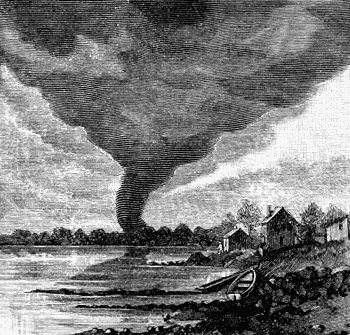
Two possible ideas with an event that happened during my great-grandfather's time: a large tornado passing through the area.
Tuesday, February 14, 2012
Assignment #2: Final
Here's my final graph assignment. I ended up using a pie chart for my weekly distribution of time. The values shown in the face/pie are roughly proportional to the hours, on a 100% scale. After that, I just started playing with the pen tool and liked the way the chart expanded into concentric swirls. I ended up changing the primary font to Cooper, mainly because I liked the way it looked alongside my straightforward graph colors.

Tuesday, February 7, 2012
Project 1: First Draft
Okay, here's my first draft for the diagram/chart assignment. For some reason or another, I was hitting a brick wall on ideas so I ended up doing a simple pie chart breakdown of my average week this semester. The colors are meant to reference simple emotions for each task, i.e. blue = calming sleep.
Monday, January 30, 2012
Space and Balance
Right, here's a couple of interesting images playing with space and balance.
First up, a promotional image from Batman: Arkham City. I really love the art direction for this series of images. With everything all white except one color, the image really pops out. Also, the artists made use of the background by not having one, bringing all focus to the character.
On that note, using white in the absence of a foreground element can also draw attention, like with this plane image. Also, the framing of the black negative space makes for a much more dynamic image.
This one just has a great interplay between the subject and the background. Both are equally important in establishing the shot and in giving a vast sense of space to the viewer. Also, the balanced composition makes for a simple yet elegant design.
Tuesday, January 24, 2012
Subscribe to:
Posts (Atom)